For a decade, Apple and Google converged on flat, clean, minimalist interfaces. iOS 7 and Material Design 1 shipped a year apart and looked fundamentally similar. That era is over. In 2026, the two dominant mobile design systems have diverged harder than at any point since skeuomorphism died.
Apple's Liquid Glass — introduced at WWDC 2025 by Alan Dye (Vice President of Human Interface Design) on June 9, 2025 and deployed across iOS 26, iPadOS 26, macOS Tahoe 26, watchOS 26, tvOS 26, and visionOS 26 — is a translucent, lensing, depth-driven material system. Google's Material 3 Expressive — announced at Google I/O on May 13, 2025 and rolled out through 2025 via Android 16 QPR1 (September 2025), now standard in Android 16 and Wear OS 6 — is a bold, springy, emotion-driven personalization system grounded in 46 separate research studies with 18,000 participants. They're not just different styles. They're different bets on what interfaces should do.
Both companies shipped their most significant design-language evolution in a decade within 30 days of each other in mid-2025. The convergence era that defined 2014-2024 is genuinely over.
This post is the complete comparison. What each system is, how they differ on every dimension that matters (motion, color, shape, typography, accessibility), who's adopting them, and what a designer needs to decide when shipping cross-platform in 2026.
TL;DR — Key Takeaways
For a decade, Apple and Google converged on flat, clean, minimalist interfaces.
- Liquid Glass is Apple's unified design language introduced by Alan Dye (VP Human Interface Design) at WWDC on June 9, 2025. Deployed in iOS 26, iPadOS 26, macOS Tahoe 26, watchOS 26, tvOS 26, and visionOS 26.
- Material 3 Expressive announced at Google I/O May 13, 2025. Rolled out via Android 16 QPR1 (September 2025), now standard in Android 16 and Wear OS 6 — with a claimed 10% battery improvement on Wear OS 6 per Google's materials.
- Built on 46 separate research studies with 18,000 participants — Google's internal research reports users identified UI elements 4× faster in Expressive layouts versus standard Material 3.
- Two opposite philosophies: Apple bets on sensory depth (preparing for spatial computing via visionOS). Google bets on emotional expression (preparing for personalization at scale).
- Third-party adoption favors Apple: Monzo, Trello, AllTrails, Telegram, Zomato shipped Liquid Glass redesigns. Material Expressive adoption outside Google's own apps is slower.
- Both face accessibility and legibility criticism. Apple added toggles (Reduce Bright Effects) in iOS 26.4. Google embeds accessibility more deeply by default.
- For cross-platform teams, the convergence era is genuinely over — designing once no longer works.
Background: How We Got Here
To understand why this divergence matters, you need a quick history.
In 2013, Apple released iOS 7 and ended skeuomorphism — no more wood grain, no more leather stitching. Flat design ruled. A year later, Google launched Material Design, inspired by "digital paper" — flat surfaces with shadows and elevation. Different in feel, similar in flatness.
Material evolved through Material 2 (2018), Material You (2021, with Dynamic Color), and now Material 3 Expressive (2025). Each update added personalization and adaptability. Apple made smaller iterative changes — the Dynamic Island, visionOS glass — but kept its core flat-ish aesthetic until WWDC 2025.
Then both companies shifted at once. Apple unveiled Liquid Glass: a unified, multi-platform design material. Google unveiled Material 3 Expressive: an emotion-first, physics-driven update to Material You. Both grounded in extensive research. Both rolled out through 2025 and now defining how billions of devices look and feel in 2026.
What Liquid Glass Actually Is
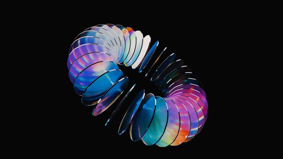
Liquid Glass is Apple's term for a dynamic, translucent, lensing material that forms the visual layer of the OS. It's not a theme or a skin — it's a material system that behaves like physical glass.
Three foundational principles drive it. First, content leads. Controls float above content on glass layers instead of sitting in solid boxes. The tab bar shrinks when you scroll, expanding back when you return. The interface gets out of the way.
Second, hardware-aligned geometry. UI elements mirror the rounded corners of Apple's hardware, the HDR displays, the edge-to-edge screens. The software feels integrated with the device, not layered on top.
Third, cross-platform harmony. For the first time, a single design language spans watch, phone, tablet, desktop, TV, and spatial computing. The same "material" adapts its expression to each surface while staying recognizable.
Mechanically, Liquid Glass relies on real-time rendering. Background content refracts through layers. Highlights react to device motion. Apple silicon handles the GPU load with negligible battery impact when implemented correctly. The material automatically adjusts between light and dark modes based on what's behind it.
The bet: Apple believes the next decade of interfaces is about spatial computing, where transparent, depth-aware surfaces matter more than flat icons.
What Material 3 Expressive Actually Is
Material 3 Expressive is the fourth major iteration of Google's design system. It's built on Material You's foundation (Dynamic Color, personalization, adaptability) but pushes much harder on emotion, motion, and expressive choices.
It's grounded in research at an unusual scale. Google conducted 46 separate research studies with over 18,000 participants before shipping. Their headline finding: users can spot key UI elements up to four times faster in Expressive designs versus standard Material 3. Expressiveness isn't just aesthetic — it demonstrably improves usability.
Three changes define the update. First, a physics-based motion system. Standard easing curves get replaced with spring-based animations that feel more natural. When you dismiss a notification, the others respond to the drag. When you snap it off the stack, you feel a haptic rumble. Motion isn't decoration — it's the grammar of interaction.
Second, an expanded shape library. Material 3 Expressive added 35 new geometric shapes and a shape morphing system. Buttons squish. Toggles shift form. Components can transform between states with built-in morphing animations. Shape becomes a branding dimension alongside color.
Third, bolder, more adaptive color. Dynamic Color pulls from your wallpaper as before, but the expressive update pushes saturation and variation harder. Apps that opt in can enforce brand colors while still adapting to user preferences. The tension between brand and personalization finally has a workable resolution.
The bet: Google believes the next decade is about hyper-personalization, where interfaces express both user identity and brand identity at the same time.
Side-by-Side Comparison
Here's how the two systems compare on every dimension that matters for a working designer.
Visual philosophy
Liquid Glass prioritizes depth and transparency. Content feels layered in physical space. Toolbars float. Glass refracts. The interface suggests three-dimensionality even on a flat screen.
Material Expressive prioritizes boldness and emotion. Colors are vivid. Shapes are prominent. Motion is springy. The interface wants to feel alive, warm, playful.
If Liquid Glass is a calm, high-end boutique, Material Expressive is a vibrant, well-designed coffee shop.
Motion and animation
Liquid Glass motion is fluid and gravity-like. Tab bars shrink smoothly. Navigation bars dissolve into translucency. Elements morph rather than toggle. The animation language is cinematic.
Material Expressive motion is springy and physics-based. Elements overshoot and settle. Drags deform nearby elements. Haptic feedback pairs with visual animation. The motion language is tactile.
For designers: Material Expressive's spring-based system is easier to implement consistently because it's formalized (with tokens, named curves, and a motion physics spec). Liquid Glass motion looks better but depends on Apple's proprietary rendering.
Color
Liquid Glass uses a restrained, adaptive palette. Color comes from the content behind the glass, not from the glass itself. Apple pushes designers toward fewer, subtler accent colors. The material does the visual heavy lifting.
Material Expressive uses a bold, personalized palette. Dynamic Color pulls from the user's wallpaper and applies system-wide. Apps can set brand accents and tertiary colors. High contrast is required; subtle isn't a goal.
Typography
Liquid Glass refined Apple's existing type system (SF Pro). Minor scale adjustments, more context-aware weight shifts. Not a dramatic change.
Material Expressive introduced an expanded typography scale with emphasized styles for hierarchy. Headlines can be much larger and bolder than in past Material versions. Type becomes a primary expressive tool, not just a readability concern.
Shape and form
Liquid Glass relies on soft, rounded, consistent geometry. Corner radii match the device hardware. Shapes feel calm.
Material Expressive uses variable, morphing shapes. 35 new geometric profiles are available. An eco-brand might use organic asymmetric curves. A tech brand might use sharp polygons. Shape carries brand meaning.
Accessibility
Both systems face legitimate accessibility concerns, but they handle them differently.
Liquid Glass has been criticized since launch for legibility in low-contrast conditions, particularly in sunlight. Apple has responded with system-level controls: Reduce Transparency has been refined, Reduce Bright Effects was added in iOS 26.4, and Reduce Motion now more reliably dampens Liquid Glass animations. These are accessibility toggles, which means the default experience can still be hard for some users.
Material Expressive embeds accessibility more deeply by default. Contrast ratios adjust automatically to environmental factors. Haptic feedback intensity adapts to user needs. Animation speeds respect user preferences baked in at the system level, not behind toggles. Google's research emphasis on older and younger users (who struggle most with minimal UIs) shaped these defaults.
For cross-platform teams: if accessibility is a primary concern, Material Expressive's defaults are friendlier. Liquid Glass requires more active accessibility work.
Performance and cross-platform
Liquid Glass only works well on Apple hardware. The real-time glass rendering, refraction, and motion rely on Apple silicon. Try to replicate the effect on Android or the web and it feels cheap or performs poorly.
Material Expressive travels better. It's open-source, its physics motion system is specified, and its shape library is available in Jetpack Compose with equivalents being ported to other frameworks. Android OEMs, third-party web projects, and Flutter apps can adopt it with reasonable fidelity.
Third-Party Adoption: Apple Is Winning
This is the part most comparison pieces miss. Design systems live or die by adoption, not launch-day polish.
Liquid Glass adoption has been rapid and enthusiastic. Monzo was among the first financial apps to adopt it. Trello redesigned its board view with Liquid Glass tab bars. AllTrails, Telegram (cross-platform, including Android), Zomato, Obsidian, and many others have shipped Liquid Glass-inspired redesigns. Apple's Developer site curates an expanding gallery of third-party adoptions.
Material Expressive adoption outside Google's own apps is much slower. Google Drive completed its Expressive redesign in January 2026. Google's own suite is updated. But most non-Google Android apps still use the prior Material You aesthetic, or their own custom designs. Even Pixel apps shipped by OEMs often skip the most expressive choices.
Why the gap? Two reasons. First, Apple's reputation halo — "premium" aesthetics travel. Companies adopt Liquid Glass to signal quality, even on Android. Second, Material Expressive's research-backed subtlety doesn't photograph as well on a launch-day keynote — designers see Liquid Glass and say "wow," see Material Expressive and say "nice."
For designers: if you're shipping a flagship product, Liquid Glass influences cross-platform design trends more than Material Expressive does. But if you're shipping native Android, Material Expressive is becoming table stakes.
What This Means for Cross-Platform Teams
Convergence is over. A shared design system that looked "modern" on both platforms in 2022 now looks dated on both in 2026.
Three pragmatic paths for cross-platform teams.
Path 1: Native on both, embrace divergence. Two design systems, two implementations. Highest quality, highest cost. Justified for companies whose brand lives on the polish of each platform.
Path 2: Lean one direction. Pick Liquid Glass or Material Expressive as your primary language, then selectively adapt. Most cross-platform teams I've seen in 2026 lean Liquid Glass-ish — translucent surfaces, floating elements — because the aesthetic photographs better in App Store screenshots. This works visually but risks feeling non-native on Android.
Path 3: A platform-neutral design language. Many web-first SaaS products (Linear, Vercel, Notion, Stripe) are deliberately ignoring both and shipping their own opinionated design language. This works if your product is web-primary and your mobile apps are thin wrappers. It breaks if you have deep native integration.
There's no universal right answer. The wrong answer is pretending the convergence era still exists.
What Designers Should Actually Do
Three practical recommendations for 2026.
Learn both systems deeply, even if you ship on one. The design thinking inside each (Apple's content-first material language; Google's research-driven emotion work) applies across contexts. Understanding both makes you a better designer even on the web.
Audit your product for accessibility. Both systems introduce new accessibility risks. Transparent surfaces can fail contrast. Springy motion can trigger vestibular issues. Test with Reduce Motion, Reduce Transparency, and high-contrast modes enabled. Ship the toggles where your platform provides them.
Don't copy-paste aesthetics. Liquid Glass without Apple silicon looks cheap. Material Expressive without its motion system looks boring. If you're adopting visual cues from either, adopt the engineering foundation too — or don't.
Frequently Asked Questions
What is Apple Liquid Glass?
Liquid Glass is Apple's unified design language introduced at WWDC 2025 and deployed across iOS 26, iPadOS 26, macOS Tahoe 26, watchOS 26, and tvOS 26. It's built around a translucent, refractive material that behaves like physical glass — bending light from content behind it, reacting to device motion, and adapting between light and dark modes automatically.
What is Material 3 Expressive?
Material 3 Expressive is the fourth major iteration of Google's design system, announced at Google I/O 2025. It evolves Material You with a physics-based motion system, 35 new geometric shape profiles, expanded typography, and bolder personalized color. It's rooted in 46 research studies with over 18,000 participants and is now standard in Android 16 and Wear OS 6.
Which is better, Liquid Glass or Material Expressive?
Neither is universally "better" — they reflect different bets. Liquid Glass is better if your priority is premium aesthetics, cross-device harmony in the Apple ecosystem, and preparing for spatial computing. Material Expressive is better if your priority is emotional personalization, accessibility-by-default, and research-validated usability at scale.
Does Android have Liquid Glass?
Android does not officially support Liquid Glass — it's Apple's proprietary design language. However, many third-party apps (including some on Android) have adopted translucent, glass-style UI inspired by it. Telegram, for example, uses Liquid Glass-style nav bars on both iOS and Android. The effects are visual approximations, not native Apple rendering.
Is Material Expressive on iOS?
Material Expressive is open-source and can be implemented on iOS, but it rarely is. Most apps shipping on both platforms either adopt Liquid Glass on iOS and standard Material on Android, or use their own cross-platform design language. Native Material Expressive on iOS would feel non-native to iOS users.
When was Liquid Glass released?
Liquid Glass was announced at WWDC 2025 (June 2025) and shipped publicly in September 2025 with iOS 26, iPadOS 26, macOS Tahoe 26, watchOS 26, and tvOS 26. Apple continues refining it through point updates — iOS 26.4, released in April 2026, added customization options including Reduce Bright Effects.
Looking for cross-platform design resources that work with both design philosophies? Browse Mantlr's curated [iOS design kits](https://mantlr.com/categories/ios-design), [Android design kits](https://mantlr.com/categories/android-design), and [design system resources](https://mantlr.com/categories/design-systems) — free and vetted by working designers.
To go deeper on the motion side of modern design systems, read [Motion Design Principles in 2026](https://mantlr.com/blog/motion-design-principles-2026). For the broader design system discipline context, see [Why Most Design Systems Get Abandoned in 2026](https://mantlr.com/blog/why-design-systems-abandoned). For dark mode implications specifically, see [Dark Mode Is Harder Than You Think in 2026](https://mantlr.com/blog/dark-mode-harder).
Primary source references (all retrieved April 24, 2026):
- Apple: Liquid Glass Developer Documentation
- Apple: WWDC 2025 keynote (June 9, 2025, Alan Dye spokesperson)
- Apple: Human Interface Guidelines
- Google: Expressive Material Design research — 46 studies, 18,000 participants, 4× faster UI element identification
- Google I/O 2025 Keynote (May 13, 2025)
- Material Design 3
- Android 16 release notes — Android 16 QPR1 delivered Expressive in September 2025
- Wear OS 6 battery improvements — claimed 10% improvement
Methodology note: Primary sources for Liquid Glass come from Apple's official documentation and WWDC 2025 keynote. Primary sources for Material 3 Expressive come from Google's I/O 2025 announcement and official research page. The third-party adoption assessment ("Liquid Glass is winning") is observation from published developer showcases and app redesigns in 2025-2026 rather than a controlled study.