<!--
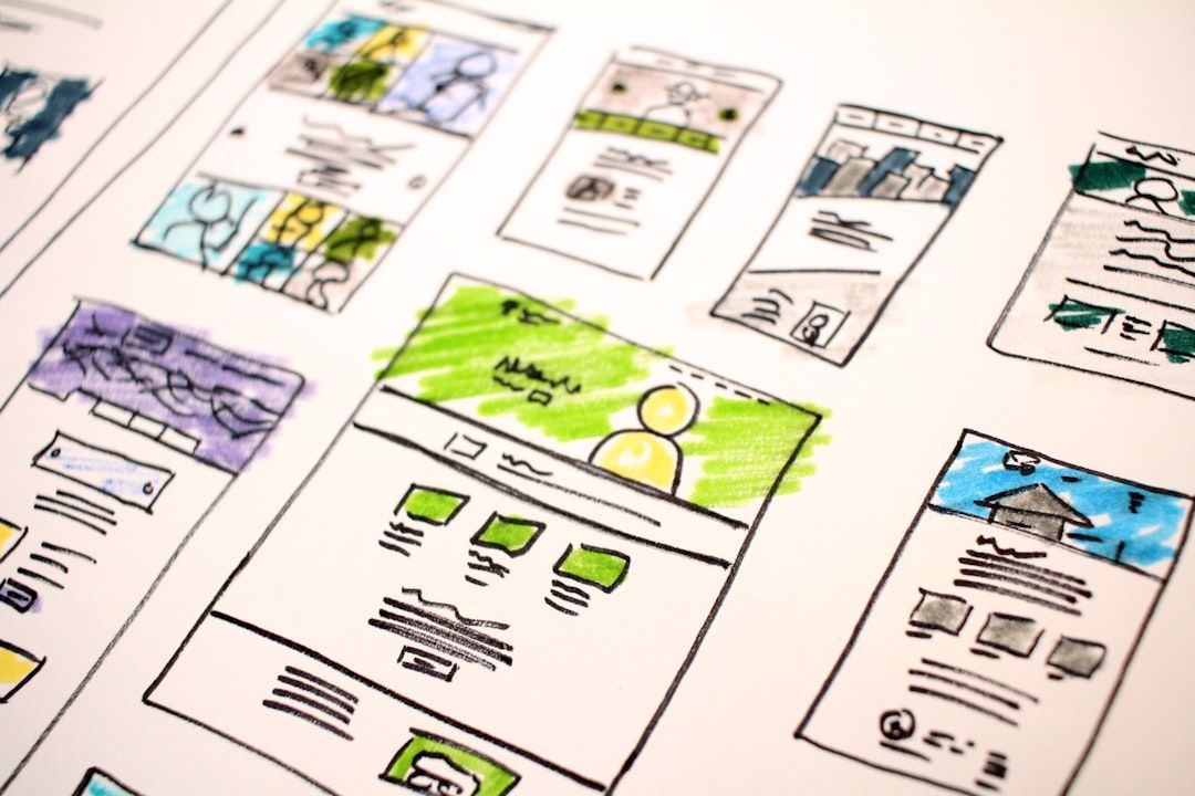
IMAGE: HERO (cover image, 1600×900)
RENDER: A 16:9 dark-mode shot of the Penpot canvas with LabyrinthUI components arranged across the workspace — sidebar nav, top bar, dashboard cards, a chart, and a data table — composed to look like a real product screen, not a UI kit page.
ALTERNATIVE: A 2×4 grid collage of 8 template thumbnails (LabyrinthUI, Ant Design, Material Design 3, Plants App, Smartwatch UI, Dashboard UI Kit, Tailwind Kit, Minimalistic Wireframing Kit) with consistent rounded-corner border treatment on a #0E0F11 background.
FILE: /images/blog/best-free-penpot-templates-2026-hero.png
ALT TEXT: "Free Penpot templates for UI design in 2026 — UI kits, dashboards, and design systems shown on the Penpot canvas"
-->
You are either evaluating Penpot for the first time, or you have been using it for a few months and you are tired of redrawing the same sidebar, the same login form, the same dashboard shell for the fifth time this quarter. Either way, you want the same thing: a free Penpot template that is actually usable, made by someone who maintains it, and not a recycled Figma file with the components ripped out.
This is the list. Hand-picked, all free, all verified working in the current 2026 Penpot build. Grouped by what you actually need to ship: SaaS dashboards, mobile apps, full design systems, wireframes, and icon libraries. Every entry below names the author, says who it is best for, and flags where it falls short. No filler.
A bit of context on why this list exists at all. Penpot crossed 1 million registered users in January 2026 after 300% year-on-year growth, closing roughly 85% of the feature gap with Figma's core features. The community now ships templates at a pace that genuinely competes. Unlike Figma Community, every file you download is yours to keep, fork, self-host, and use without a per-seat license.
Skip to the comparison table for the short version. Read on for the reasoning behind each pick.
All Penpot templates in this guide are curated on Mantlr — verified working in 2026, sorted by use case, with license and token support noted.
Why free Penpot templates matter more in 2026
IMAGE: HERO (cover image, 1600×900)
Figma's March 2025 price increases (Professional plans jumped 33%, Organization tier rose 22%, and Enterprise climbed 20%) pushed budget-sensitive teams to look around for the first time in years. Penpot is the alternative that actually arrived. 80,000 teams are using it now, including groups at Google and Microsoft. The 39,100 GitHub stars are not vanity metrics; the contributors behind them are the same people writing the UI kits below.
The other reason templates matter: Penpot is SVG-native and produces clean, copyable HTML and CSS straight from the Inspect tab. A well-built Penpot template doubles as a shippable starter for the developer sitting next to you. The handoff loop that costs Figma teams hours per sprint becomes an inline copy-paste in Penpot.
Free Penpot templates at a glance
<!-- IMAGE: comparison table preview, alt text: "Comparison table of best free Penpot templates 2026 by use case, author, and design tokens support" -->
| Template | Best for | Author | Design Tokens | Source |
|---|---|---|---|---|
| LabyrinthUI | SaaS products, dashboards | Zvonimir Juranko | Yes | Penpot Hub |
| Ant Design System (Free) | Enterprise UI, web apps | Matt Wierzbicki | Partial | Penpot Hub |
| Material Design 3 | Android, cross-platform | Marcos Abreu | Yes | Penpot Hub |
| Material Design Baseline | Spec-accurate Material work | Yes | Penpot Hub | |
| Tailwind Kit | Tailwind-based UIs | Mejlak | Yes | Penpot Hub |
| Bootstrap 5 Starter UI Kit | Marketing sites, prototypes | Jitu Chauhan | No | Penpot Hub |
| Dashboard UI Kit | Admin panels, analytics | ByeWind | Partial | Penpot Hub |
| Plants App | Mobile e-commerce reference | Penpot Team | Yes | Penpot Hub |
| Smartwatch UI | Wearable / watchOS concepts | Penpot Team | No | Penpot Hub |
| Minimalistic Wireframing Kit | Early-stage wireframes | Laura Kalbag | No | Penpot Hub |
All ten are free, downloadable as .penpot files, and licensed for both personal and commercial work.
Free Penpot SaaS and dashboard templates
The SaaS category is where Penpot's design tokens shine, and where you save the most time by starting from a template instead of redrawing the same sidebar nav for the fifth time this year.
LabyrinthUI: the most complete free Penpot SaaS UI kit
Best for: SaaS products, dashboards, B2B admin consoles | Author: Zvonimir Juranko | Themes: Light + dark | Design Tokens: Yes
LabyrinthUI is built by Zvonimir Juranko specifically for SaaS products. The author launched it in mid-2025 with a stated goal of being a flexible, modern resource for Penpot users, and unlike many "free" UI kits, the entire library is genuinely free. No email gate, no upgrade nag. It ships with light and dark modes powered by Penpot's native Design Tokens, which means you can re-theme the whole kit by swapping a token set instead of touching individual components.
Use it as a starter for billing flows, admin consoles, customer dashboards, or settings-heavy B2B products. Pair it with Penpot's Flex Layout for responsive frames and you will have a working prototype before lunch.
Where it falls short: marketing pages are not its strength. If you need landing-page hero sections or pricing tables, supplement with a Bootstrap or Tailwind kit.
Dashboard UI Kit by ByeWind: clean analytics template
Best for: Analytics dashboards, admin panels | Author: ByeWind | Specialty: Charts + KPIs
Cleaner aesthetic than LabyrinthUI, and a narrower scope on purpose. It is built for analytics-style screens: KPI cards, line and bar charts, filter pills, data tables, paginated lists. The component library is tight (around 80 to 100 reusable pieces) which makes it faster to learn than a full kit but limits how far you can stretch it for non-analytics screens.
Use it when you are building a focused internal tool: a reporting dashboard for an ops team, a metrics panel for a sales lead, a usage console for a developer-facing product. The visual language leans Bauhaus: lots of whitespace, restrained color, sharp typography.
Limitation: form components and settings flows are minimal. If your product has heavy configuration screens, layer LabyrinthUI or Ant Design on top for those surfaces.
Sales Dashboard Example by Laura Kalbag: reference file for new users
Best for: Beginners learning Penpot | Author: Laura Kalbag | Scope: Single dashboard screen
This is less a UI kit and more a teaching aid. Laura Kalbag is part of the Penpot core community and has built several of the canonical reference files on Penpot Hub. The Sales Dashboard Example walks through a single, fully-built sales dashboard with proper use of Penpot's Flex Layout, Variants, and Boards: the structural primitives that beginners often skip on their way to drawing rectangles.
If you are new to Penpot and want to see how an experienced designer structures a real dashboard with the tool's components and layouts, open this file before you build your own. Spend twenty minutes reading the layer panel. You will save yourself a week of trial-and-error on layout.
Not a starter kit. Treat it as documentation.
**Browse more free SaaS design templates and UI kits in the Mantlr directory →**
Free Penpot mobile app templates
Penpot's mobile coverage is lighter than its web and dashboard coverage, but the kits that exist are well-built and worth importing if you are designing a mobile product.
Plants App and Interactive Music App by the Penpot Team
Best for: Mobile e-commerce + prototyping practice | Author: Penpot Team | Includes: Prototype connections
These are the canonical Penpot mobile examples, maintained by the Penpot team and updated alongside major releases. Both ship with real interaction states, wired-up prototyping connections between screens, and component variants in light and dark. Useful as both learning material and starter files.
Plants App is a clean e-commerce reference with product listing, detail, cart, and checkout flows. The typography and spacing system underneath is worth studying even if you never ship a plant store. Interactive Music App leans harder into prototyping. It shows how to wire screen transitions, conditional flows, and component-state changes in Penpot's prototype mode, which is one of the features that historically lagged Figma but has tightened significantly in 2025-2026.
Limitation: these are demos. The styling is opinionated and tied to the example apps. Reuse the patterns, rebuild the visuals.
Smartwatch UI: wearable concept template
Best for: Smartwatch concepts, watchOS portfolio pieces | Author: Penpot Team | Constraint: Round + square faces
If you are sketching out a wearable concept (even just for a portfolio piece), this saves you an afternoon of building the constraint primitives. The kit handles the round-face problem well: text scales, icon sets, and safe-area boundaries are all set up for the small canvas. It includes a few common watchOS-style components (complications, glances, notifications) and a typography scale that fits a 1.8-inch display without overflowing.
Use it as a base for a portfolio piece, a hackathon idea, or a serious wearable product. Limitation: Android Wear / Wear OS styling is not the primary focus, though the components are flexible enough to adapt.
Mastodon App by ApeWTF: federated social app reference
Best for: Open social product references | Author: ApeWTF | Style: Federated / open social
A community-built reference for federated social apps. Useful in two scenarios: you are actually designing for the Mastodon or ActivityPub space, or you want to see how a real social feed UI decomposes into Penpot components (avatars, post cards, timeline scrolling, threaded replies, image attachments, hashtags). The patterns transfer to any social product, not just federated ones.
ApeWTF also maintains a Firefox Mockup template on Penpot Hub. If you build a lot of demos that show "this is what the user sees in their browser," it is worth grabbing both files at once.
Android & iOS Keyboards Kit by Mosn
Best for: Mobile mockups, system keyboard overlays | Author: Mosn | Platforms: Android + iOS
Niche but high-utility. Saves you from ever mocking up a system keyboard from scratch again. The kit covers iOS keyboard variants (default, numeric, symbols, emoji bar) and Android Material 3 keyboards. Useful any time you are designing a screen that shows the keyboard up: input flows, OTP entry, chat screens, search.
Limitation: only the keyboards. You will still need to pair it with a status bar and nav bar kit if you want complete mobile chrome.
Penpot design systems and UI kits
These are the kits to import once and reuse across projects. They are not single-screen references. They are component libraries you build on top of.
Ant Design System (Free version) by Matt Wierzbicki: enterprise-ready Penpot kit
Best for: Enterprise web apps, admin consoles | Author: Matt Wierzbicki | Components: Full core set
Ant Design is the design language used by a long list of Chinese tech companies and a growing number of Western enterprise products. The free Penpot port covers the core components (buttons, forms, navigation, tables, modals, dropdowns, date pickers, alerts, breadcrumbs) and is a credible starting point for any web app aiming for an enterprise feel without paying for a commercial system.
It is one of the most complete free Penpot UI kits in the directory and a good choice if your product needs density: lots of forms, lots of tables, lots of nested navigation. The Wierzbicki port is unofficial but tracks the upstream Ant Design spec closely.
Limitation: the visual language is dense and opinionated. If your product is consumer-facing or aims for a marketing-led aesthetic, this is the wrong starting point.
Material Design 3 by Marcos Abreu: community MD3 implementation
Best for: Android-first products, cross-platform apps | Author: Marcos Abreu | Spec: Material 3
The community implementation of MD3. Marcos Abreu's port is the faster jump-in for most teams: opinionated where the spec is permissive, ready to use the day you import it. It includes the core MD3 components (FAB, app bars, navigation rail, snackbars, sheets, cards) with Penpot Variants set up for state changes.
If you are building for Android, this is the most efficient starting point. Use it as a base layer and overwrite the color tokens to match your brand.
Material Design Baseline by Google: spec-accurate reference
Best for: Spec-accurate Material work, design system teams | Author: Google | Spec: Conservative MD3
Google's official Material Design Baseline is the conservative reference. Less opinionated than Marcos Abreu's community port, more accurate to the published spec. If you are running a design system team and you want a canonical source of truth for Material patterns, start here.
For shipping product work, the community implementation is usually faster. For documentation, system reviews, and "what does the spec actually say" debates, use the Baseline file.
Tailwind Kit by Mejlak: Penpot kit for Tailwind-shipping teams
Best for: Designer-developer teams shipping in Tailwind | Author: Mejlak | Match: Tailwind utility classes
A Penpot kit that matches Tailwind's utility-class system. Particularly useful for designer-developer pairs already shipping in Tailwind: what you draw closely matches what the developer will write, which cuts the handoff loop dramatically. Spacing, color, and typography tokens map cleanly to Tailwind's default scale.
Use it as your team's base layer if you are a Tailwind shop and the developer outnumbers the designer (a common Penpot pattern). Limitation: it is a starter, not a full component system. You will need to extend it with your product-specific components.
Bootstrap 5 Starter UI Kit by Jitu Chauhan
Best for: Marketing sites, Bootstrap-based prototypes | Author: Jitu Chauhan | Style: Familiar Bootstrap aesthetics
Familiar territory for anyone who has shipped a Bootstrap site over the past decade. Use it for marketing pages, dashboards, and admin panels where opinion matters less than speed. The kit covers Bootstrap's standard components (cards, modals, accordions, alerts, tab groups, pagination) styled to match the default Bootstrap 5 theme.
If you are building a quick marketing site or a prototype that will ship on a Bootstrap codebase, this is the lowest-friction starter on Penpot Hub. Limitation: the aesthetic is dated relative to modern Tailwind or shadcn-style design systems. For a contemporary look, layer your own typography and spacing on top.
**See more free Penpot design systems and component libraries on Mantlr →**
Penpot wireframing and prototyping templates
When you do not yet know what you are building, fidelity is the enemy. Stakeholders see a colored mockup and start arguing about button radius before they have agreed on the navigation structure. Wireframing templates exist to keep the conversation focused on shape, not skin.
Minimalistic Wireframing Kit by Laura Kalbag
Best for: Early-stage low-fidelity sketches | Author: Laura Kalbag | Style: Deliberately rough
A small, deliberately ugly set of low-fidelity shapes. Exactly what wireframing is supposed to look like. Use it in early discovery, in design reviews where you do not want stakeholders fixating on colors, or to sketch a flow in fifteen minutes instead of two hours. The shapes are intentionally chunky (input fields, buttons, image placeholders, dropdowns) so they read as "this is a wireframe" at a glance, not "this is a low-quality mockup."
Pair it with Penpot's prototype mode to wire up a clickable low-fi prototype. You can run a quick five-user research session on a prototype built with this kit in a day.
Community Wireframes by Systxema
Best for: Mid-fidelity wireframes, structured flows | Author: Systxema | Style: Structured grid
Larger library, slightly higher fidelity. Good for the second pass, after you have validated the rough flow with the Kalbag kit and want to add a layer of structure before you commit to a real visual design. Systxema's wireframe components include navigation patterns, hero layouts, content blocks, and form structures: the building blocks of a typical SaaS or marketing site.
The kit is opinionated about grid use. If you are not already a grid-first thinker, this will nudge you in that direction, which is generally a good thing for production work.
The Complete Website Design Process by Marizu Dominic
Best for: End-to-end website design, learning the process | Author: Marizu Dominic | Format: Multi-stage template
This is a template-as-tutorial. It walks through the full website design process from sitemap to wireframe to high-fidelity mockup, all in a single Penpot file. Useful if you are new to website design and want a structured example to learn from, or if you are running a design workshop and need a reference artifact to walk a team through the standard stages.
Not a production starter. Treat it as a teaching aid.
Lean UX Canvas by the Penpot Team
Best for: Project kickoff workshops | Author: Penpot Team | Type: Workshop canvas
Not a UI kit. A workshop canvas for assumptions, hypotheses, MVP planning. Useful for kicking off a project the right way before anyone draws a screen. Print it, use it as a digital reference during remote workshops, or run a 90-minute Lean UX session before your first design sprint of a new initiative.
Prototype Examples by Laura Kalbag
Best for: Learning Penpot prototyping | Author: Laura Kalbag | Type: Reference file
A reference file showing Penpot's prototyping connections, transitions, and variant interactions. Open it once to learn the patterns, then build your own. The example covers screen-to-screen navigation, overlay sheets, conditional flows, and component-state changes, which is most of what you need to build a clickable prototype that a user can actually navigate.
Icon libraries on the Penpot Hub
Icons are not templates in the strict sense. You do not import them as starter files. You import them as shared libraries so the icon set is available across every file in your team's project. Penpot's shared library system is one of the under-appreciated features of the tool: a single library can be referenced by hundreds of files, and updates propagate automatically.
Here are the icon libraries worth importing into your team's Penpot workspace.
Heroicons (Tailwind Labs)
Best for: SaaS UIs, modern web products | Style: Outline + solid, 24×24
Tailwind Labs' icon set, the de facto modern default for SaaS interfaces. Two stroke weights (outline and solid), tight coverage of the icons you actually need (navigation, actions, status, files, common verbs). If your product is built with Tailwind or shadcn/ui on the development side, your designer should be using Heroicons in Penpot. The icons match what the developer ships, which eliminates one of the silliest debates of every design review.
Feather Icons (Mejlak)
Best for: Minimalist UIs, content-heavy products | Style: Stroke-based, neutral
Feather is the older sibling of Heroicons: minimalist, neutral, stroke-based. Use it when you want a visual language that gets out of the way. Feather works well in content-heavy products (publishing, knowledge bases, documentation) where the icons should support the text rather than compete with it.
Radix UI Icons (Enieber)
Best for: shadcn-style component systems | Style: 15×15, geometric
Radix UI Icons pair cleanly with shadcn/ui-style component systems. Smaller default size (15×15 instead of 24×24), more geometric, slightly more opinionated than Heroicons. If your team has standardized on shadcn/ui in the codebase, use Radix Icons in Penpot. The mapping will be one-to-one and the developer will thank you.
Material Design Icons (Pictogrammers)
Best for: Material apps, Android products | Style: Material 3 icon language
Exhaustive set for Material projects. Pictogrammers maintains the most complete community port of Material icons available for any design tool, including Penpot. Use it as the canonical icon source for any Material-aligned product.
PrimeIcons (@r3ps4J)
Best for: PrimeReact / PrimeVue products | Style: Solid, PrimeFaces aesthetic
Works well with PrimeReact or PrimeVue systems if your developers use them. Less common in the Penpot ecosystem than Heroicons or Material, but if your stack runs on PrimeFaces, this is the matching icon set. Worth the import only if your codebase uses Prime; otherwise skip it.
Blender Icons
Best for: 3D tools, creative software references | Style: Domain-specific
Niche but useful for 3D and creative tools, plugin UIs for Blender add-ons, or any product that talks to 3D workflows. Most teams will not need this. The ones that need it, need it badly.
iOS Icon Template by Victor Crespo
Best for: App icon export | Style: Apple HIG-compliant export sizes
Not an icon library. An app icon export template. App icon export sizes done once, correctly: 1024×1024 source, all required export sizes for the App Store, all device-specific variants. Saves you twenty minutes of squinting at Apple's Human Interface Guidelines every time you ship a new app version.
How to use icon libraries in Penpot
Import an icon library file, then publish it as a Shared Library from the Libraries panel. Once published, every file in your team can pull components from that library by adding it as a linked library. Updates to the source library propagate automatically. If Heroicons ships a new icon set, you update the library file once and every project gets the new icons.
How to import a Penpot template in 2026
The flow is short. From the Penpot dashboard:
1. Open the project where you want the template.
2. Click Libraries & Templates in the bottom-right corner of the dashboard.
3. Browse the Penpot Hub or click Import file to upload a .penpot file you downloaded from GitHub or the community.
4. Confirm the import and the file lands in your drafts.
5. To use a template as a shared library across multiple files, open the file, go to Libraries, and toggle Publish so the components are available to other projects.
This is the canonical flow described in Penpot's official help center. The newer Penpot file format is a ZIP archive containing standard SVG and JSON, which means template files are inspectable, Git-friendly, and not locked to a proprietary binary the way Figma files are.
What to check before downloading a free Penpot template
A few practical checks save you time after the fact:
- License. Almost everything on Penpot Hub is permissive, but confirm before commercial use. Community-uploaded files sometimes carry author-specific terms.
- Last update. Penpot has evolved fast through 2025-2026. Templates updated within the past six months are more likely to use current features like Design Tokens, Variants, and CSS Grid Layout.
- Variants and tokens. A template that uses Penpot's native Variants and Design Tokens will save you days versus one that is essentially flat, copy-pasted frames.
- Component count vs. screen count. A kit with 200 components is usually more useful than a kit with 50 screens but no reusable parts. Reusable parts let you build any screen; finished screens lock you into someone else's product.
- Author maintenance pattern. Check the author's profile on Penpot Hub or GitHub. A kit shipped in 2024 with no updates since is a fossil. A kit shipped in 2025 with regular commits is a living asset.
Frequently asked questions
Does Penpot have free templates?
Yes. The Penpot Hub (penpot.app/penpothub/libraries-templates) hosts a growing library of free, community-contributed templates, UI kits, and icon libraries. All can be downloaded as .penpot files and imported into any Penpot project, hosted or self-hosted, at no cost.
How do I import a template into Penpot?
From the Penpot dashboard, open the project where you want the template, click Libraries & Templates in the bottom-right, then either browse the Penpot Hub or upload a .penpot file from your machine. The file imports into your drafts and can be promoted to a shared library so its components are available across other files.
Are free Penpot templates okay to use in commercial work?
Generally yes, but check the individual template's license. The Penpot-authored examples and most community uploads on Penpot Hub are permissively licensed, but specific contributors may add their own terms. Open the template's page on the Hub or its GitHub README before shipping it inside a paid product.
What is the best free Penpot template for SaaS?
LabyrinthUI by Zvonimir Juranko is the most complete free Penpot SaaS UI kit on Penpot Hub in 2026. It ships with light and dark themes, Design Tokens, and components designed specifically for B2B product surfaces. Pair it with the Dashboard UI Kit by ByeWind if you need richer analytics screens.
Can I use Figma templates in Penpot?
Partially. Penpot supports importing some Figma files via the Penpot Exporter plugin, but complex Figma files with Auto Layout, advanced Variants, or third-party plugin dependencies often need cleanup after import. For most production work, starting from a native .penpot template is faster than migrating a Figma file.
Where can I find Penpot UI kits beyond the Penpot Hub?
The official Penpot Hub is the largest curated source, but additional kits surface on the penpot/penpot-files GitHub repository, the Penpot Community forum, and individual designer portfolios on Dribbble (search the penpot tag). Mantlr also curates a hand-picked selection of design tool templates across Penpot, Figma, and Framer.
Where to go from here
If you are early in Penpot, open LabyrinthUI and the Plants App. The first will show you what a serious SaaS system looks like in the tool. The second will show you how to think about mobile flows and prototyping connections. Two imports, one afternoon, and you will have a clear sense of whether Penpot fits your work.
If you have been on Penpot for a while and are tired of rebuilding the same dashboards, pick a kit with Variants and Design Tokens (LabyrinthUI, Material Design 3, Ant Design) and treat it as the base layer of your team's design system. Custom work goes on top, not from scratch.
Discovering more Penpot resources on Mantlr
Mantlr curates every Penpot template, UI kit, and design tool worth knowing — verified for the 2026 Penpot build:
- **LabyrinthUI on Mantlr**: direct link, version notes, and the author's release history.
- **Penpot on Mantlr**: every official Penpot library and template, MCP server documentation, and setup guides.
- **Design Tools on Mantlr**: Penpot, Figma, and other design tools compared side by side for teams considering a switch.
- **Design Systems on Mantlr**: Material 3, Ant Design, shadcn/ui, Tailwind UI, and other system kits in one place.
- **UI Kits on Mantlr**: every free and freemium SaaS UI kit Mantlr has reviewed in 2026.
Penpot crossed 1 million users because free actually works. Mantlr curates 500+ design resources — Penpot templates, Figma alternatives, UI kits, and design systems — hand-picked and verified so you spend time designing, not searching.
Sources and methodology
Research conducted May 2026. Template availability and authors verified against Penpot Hub (penpot.app/penpothub/libraries-templates, retrieved May 2026) and the official penpot/penpot-files GitHub repository (retrieved May 2026). Penpot adoption and growth figures from Tech Economy Africa (January 2026) and Byteiota's coverage of Penpot's Hacker News surge (November 2025). Figma pricing change figures from the same source, citing Figma's published March 2025 plan increases. Penpot import workflow verified against the official Penpot help center (help.penpot.app, retrieved May 2026).
About Mantlr
Mantlr is a hand-picked directory of design tools, UI kits, templates, and resources for working designers and developers. Every resource is reviewed before listing. We publish weekly guides on the tools designers actually use to ship.