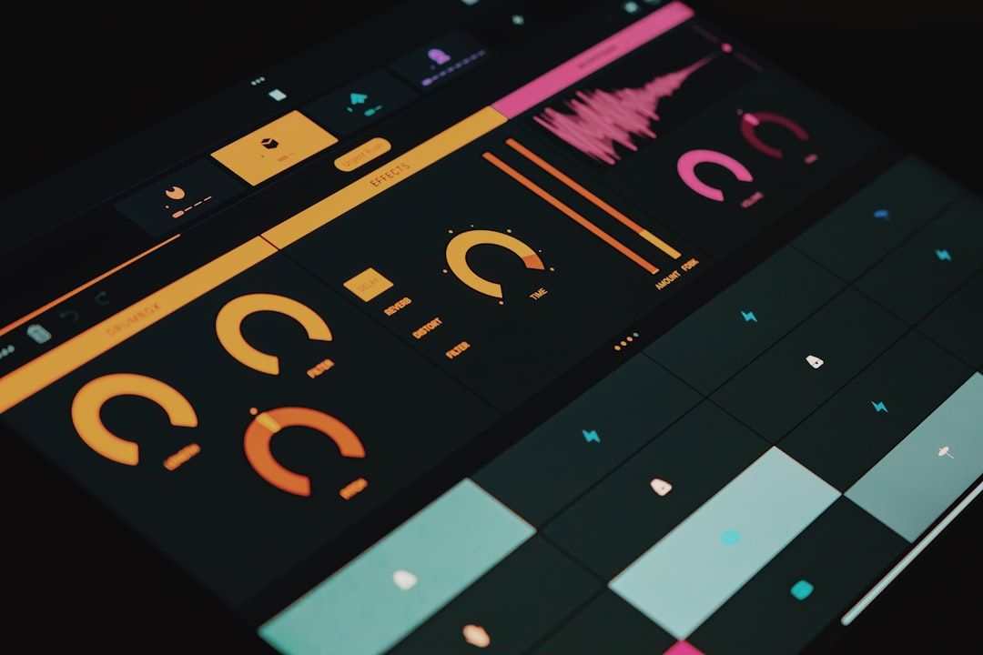
You know the feeling. You download a free Figma UI kit, open it, and within 30 seconds you can tell. Fixed-width frames instead of Auto Layout. Color values hardcoded into every component. No dark mode. A naming convention that looks like someone sneezed on their keyboard.
Free UI kits have a reputation problem, and most of them deserve it. But buried in the Figma Community's 4,700+ free kits are a handful that are genuinely production-quality — designed with Variables, proper Auto Layout, responsive components, and the kind of file organization that would pass a design system review.
I spent two weeks downloading and evaluating free kits. Here is what separates the professional ones from the rest, and which specific kits are worth your time.
What makes a free UI kit "look free"
You know the feeling.
Before the recommendations, here is what to check in any free kit — because the screenshots always look polished, and the file quality often does not match.
Red flags that signal a cheap kit:
- Components built with fixed-width frames instead of Auto Layout
- Colors applied as hex values rather than Figma Variables or Styles
- No dark mode, or dark mode achieved by slapping a dark background behind light-mode components
- Layer names like "Frame 247" and "Rectangle 19"
- Desktop-only — no responsive or mobile variants
- Last updated in 2022 or earlier (pre-Variables, pre-min/max width)
Signals of a professional kit:
- Full Auto Layout on every component, with proper padding and spacing tokens
- Figma Variables for colors, spacing, and border radius
- True dark mode using Variable modes
- Semantic naming (e.g., surface/primary, text/secondary, not "Blue-500")
- Components with documented variants and properties
Professional-grade free kits
These are free kits I would genuinely use on client projects without embarrassment.
Untitled UI (free tier)
The gold standard for free Figma UI kits, and for good reason. The free version includes 50+ components with full Auto Layout, color Variables, and both light and dark modes. The file organization is meticulous — every component follows a consistent naming pattern, and the layer structure is clean enough to hand to a developer.
The catch: The free version covers roughly 30% of the full system. You will hit walls quickly on data tables, complex forms, and charts. It is designed to upsell you to the $89 paid version. But what you get for free is legitimately professional.
Best for: SaaS dashboards, web applications, early-stage startup MVPs.
Material Design 3 Kit (Google)
Google maintains the official Material 3 design kit, and it is both free and comprehensive. Every component follows the Material 3 specification with built-in theming through Figma Variables, responsive breakpoints, and accessibility documentation baked into the file.
The honest truth: Material Design carries a strong visual identity. If you use this kit unmodified, your product will look like a Google product. That might be perfectly fine for internal tools or Android apps. For consumer SaaS, you will want to customize heavily — which the Variable system supports, but it takes effort.
Best for: Android apps, Google Workspace-adjacent tools, teams that want a well-documented starting point.
shadcn/ui Figma Kit (community)
If your frontend uses shadcn/ui, the community-maintained Figma kit maps directly to the component library. This is not a generic UI kit — it mirrors shadcn/ui's actual component API, which means your design-to-development handoff has less translation friction.
Limitation: The kit is community-maintained, not officially supported by shadcn. Updates lag behind the actual library. But for teams already committed to shadcn/ui, this is the most practical free option.
Best for: Teams building with shadcn/ui and Tailwind CSS.
[See quality ratings and update status for 50+ Figma UI kits → Mantlr](https://mantlr.com)
Great for rapid prototyping
These kits are well-made but optimized for speed rather than production polish.
Apple Design Resources (Apple)
Apple's official iOS and macOS design kits are free, comprehensive, and updated with every OS release. They include every native component with proper variants and sizing. If you are designing native Apple apps, these are mandatory — and they are excellent.
Limitation: Obviously Apple-specific. Not useful for web or cross-platform projects.
Ant Design Figma Kit
Ant Design's official Figma resources cover the entire component library with Auto Layout and theme customization. For teams building with Ant Design on the frontend, this eliminates design-to-code mismatch.
Best for: Enterprise dashboards and data-heavy applications using the Ant Design system.
Flowbite Design System
Flowbite's free Figma kit includes 400+ components organized by category with Tailwind CSS class documentation embedded in the file. The Auto Layout implementation is solid, and the coverage of uncommon components (timeline, kanban, file upload) is broader than most free kits.
Limitation: Visual style leans toward Bootstrap territory. You will want to customize colors and border radius to avoid a generic look.
Best mobile-specific free kits
Mobile UI kits are the most underserved category in free Figma resources. Most "mobile kits" are just desktop components compressed into a phone frame.
Flavor (iOS-focused)
A clean, minimal iOS kit that includes properly sized touch targets, safe area handling, and native gesture patterns. The component count is modest (around 60), but each component is built for mobile-first interaction patterns rather than being a desktop kit crammed into a small frame.
Material 3 Mobile Components
The Material 3 kit's mobile subset is the strongest free option for Android design. It includes bottom sheets, FABs, navigation rails, and snackbars with proper spacing for thumb-reachable zones.
An honest gap in the market: There is no great free Figma kit for cross-platform mobile design — something that is neither iOS-native nor Material Design but works for React Native or Flutter apps that need to feel at home on both platforms. If someone builds this, it would fill a genuine void.
How to customize a free kit into your own system
Once you have picked a kit, do not just start designing inside it. Take 30 minutes to make it yours first.
Duplicate the file. Swap the color Variables to your brand palette — primary, secondary, neutral, and accent. Adjust the border-radius token to match your brand's feel (sharp corners feel corporate, rounded corners feel friendly). Update the spacing tokens if the kit's defaults feel too tight or too loose. Rename the file to your project name. You now have a custom design system built on a professional foundation, and every component you build from here inherits your brand automatically.
This single step is the difference between "we used a free kit" and "we built a design system."
How to evaluate any free UI kit in 60 seconds
Before downloading, check these five things in this order:
1. Open a button component. Is it Auto Layout with proper padding, or a fixed-width rectangle? This single check reveals 80% of a kit's quality.
2. Check for Variables. Select a colored element and look at the fill. Is it using a Figma Variable or a raw hex code? Variables mean the kit was built for theming and dark mode. Raw hex means pain.
3. Look for dark mode. Switch to a dark mode page or Variable mode. If it exists and components actually transform properly, the kit is maintained by someone who cares.
4. Check the last update date. Anything last updated before late 2023 probably predates Figma Variables and min/max width constraints. It will feel dated.
5. Read the naming. Open the layers panel. If you see semantic names (button/primary/large), the file is production-ready. If you see "Frame 482," close the file.
The "free version vs paid upsell" transparency check
Most free UI kits are actually marketing funnels. That is not inherently bad — Untitled UI's free version is excellent — but you should know what you are getting into.
Fully free, no upsell: Material Design 3, Apple Design Resources, shadcn/ui community kit, Ant Design kit.
Free tier with paid upsell: Untitled UI (free covers ~30%), Flowbite (free covers ~60%), most indie creator kits on Figma Community.
"Free" but requires account/newsletter signup: Several popular kits gate downloads behind email capture. I have excluded these from the recommendations unless the quality justifies the trade.
Frequently asked questions
What is the best free Figma UI kit in 2026?
Untitled UI's free tier offers the best combination of component quality, Auto Layout implementation, and file organization. For a completely free option with no paid upsell, Material Design 3 or the shadcn/ui community kit are strongest.
Is Untitled UI free?
Partially. The free version includes 50+ components with full Auto Layout and Variables support. The complete system with 800+ components, advanced templates, and priority updates costs $89.
What Figma UI kits do professional designers use?
Most professional design teams build custom component libraries rather than using third-party kits. When they use external kits, the most common choices are Untitled UI (paid version), the platform-specific kits from Apple or Google, and framework-matched kits like shadcn/ui's Figma resources.
How do I find high-quality free Figma templates?
Check Figma Community and sort by recently updated. Evaluate using the 60-second quality check: Auto Layout on buttons, Figma Variables for colors, dark mode support, clean layer naming, and an update date within the last 12 months.
How do I customize a free Figma UI kit for my brand?
Duplicate the file, then update these four things in order: (1) Swap color Variables to your brand palette, (2) Adjust border-radius tokens to match your visual style, (3) Update the heading and body font in text styles, (4) Rename all components with your project prefix. This takes 30 minutes and transforms a generic kit into a branded design system. See the customization section above for the full process.
Quality over quantity
The Figma Community has 4,700+ free UI kits. You need one. Maybe two.
Pick a kit that matches your tech stack (shadcn/ui kit if you use shadcn, Material 3 if you build for Android), verify it passes the quality checks above, and customize it into your own system. A mediocre kit that you customize well always beats a fancy kit you fight against.
[See quality ratings and update status for 50+ Figma UI kits → Mantlr](https://mantlr.com)
Written by [Author Name], a product designer with 16 years of experience across SaaS, enterprise, and startup teams. Currently building [Mantlr](https://mantlr.com) — a curated resource directory for designers and developers.