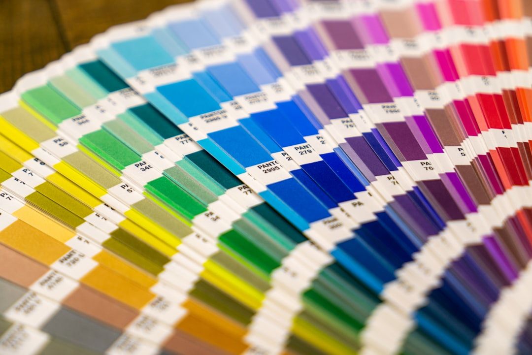
Most color palette generators are slot machines. You hit spacebar, get five random colors, hit spacebar again, repeat until something looks nice. That is not a design process — it is gambling.
I tested 12 color palette tools on a specific task: generate a complete SaaS landing page palette with primary, secondary, accent, neutral, success, warning, and error colors — plus dark mode variants — that pass WCAG AA contrast on the first try. The results were revealing. Most tools failed the dark mode requirement entirely. A few surprised me.
The test results: which tools passed the full SaaS palette task?
Most color palette generators are slot machines.
| Tool | Complete palette (7+ roles)? | Dark mode variant? | WCAG AA on first try? | Verdict |
|---|---|---|---|---|
| Realtime Colors | ✓ (with manual setup) | ✓ | ✓ | Pass |
| Leonardo | ✓ (contrast-target-based) | ✓ | ✓ | Pass |
| Reasonable Colors | ✓ (pre-checked system) | ✓ | ✓ | Pass |
| Tailwind CSS Colors | ✓ (via default scales) | ✓ (built-in) | ✓ | Pass |
| Coolors | Partial — 5 swatches max | ✗ No dark mode | ✓ (has checker) | Fail — no dark mode |
| uicolors.app | Partial — single color scales | Via toggle | ✓ | Fail — single color only |
| Khroma | ✗ Generates pairs, not systems | ✗ | ✗ | Fail — not built for systems |
| Huemint | Partial — 3-5 colors | ✗ | ✗ Failed 3 of 10 palettes | Fail — inconsistent contrast |
| Colormind | ✗ Generates 5 random colors | ✗ | ✗ | Fail — no system thinking |
| OKLCH Picker | Manual only | Manual only | Via external tools | Partial — tool, not generator |
| tints.dev | Partial — shade refinement | ✗ | ✗ | Fail — refinement tool only |
| Color Hunt | ✗ Browse-only | ✗ | ✗ | Fail — inspiration, not production |
Only 4 of 12 tools could produce a production-ready SaaS palette with dark mode and accessibility compliance. The rest are useful at specific stages of the workflow but cannot get you from zero to production alone.
The quick comparison
| Tool | Best For | Dark Mode | WCAG Check | Tailwind Export | AI-Powered | Free |
|---|---|---|---|---|---|---|
| Realtime Colors | Full-page color preview | Yes | Yes | No | No | Yes |
| Coolors | Quick palette exploration | No | Yes | No | No | Freemium |
| Huemint | Brand-context generation | No | No | No | Yes (AI) | Yes |
| Khroma | Learning your taste | No | No | No | Yes (AI) | Yes |
| OKLCH Color Picker | Perceptually uniform palettes | Manual | Via plugins | No | No | Yes |
| Tailwind CSS Colors | Tailwind-native scales | Built-in | Built-in | Native | No | Yes |
| uicolors.app | Tailwind shade generation | Via toggle | Yes | Yes (copy-paste) | No | Yes |
| tints.dev | Fine-tuning Tailwind scales | No | No | Yes | No | Yes |
| Leonardo (Adobe) | Accessible contrast targets | Yes | Yes (core feature) | No | No | Yes |
| Color Hunt | Browsing curated palettes | No | No | No | No | Yes |
| Colormind | AI palette from images | No | No | No | Yes | Yes |
| Reasonable Colors | Accessible-first palettes | Yes | Built-in | No | No | Yes |
[Every color tool in this post plus 20 more, organized by workflow stage → Mantlr](https://mantlr.com)
Coolors vs Realtime Colors — the comparison nobody has written
This is the matchup I was most curious about, because everyone recommends Coolors and almost nobody mentions Realtime Colors. They solve fundamentally different problems.
Coolors is the king of palette exploration. The spacebar workflow is addictive, the color locking system is intuitive, and the library of saved palettes gives you instant inspiration. It is the tool I recommend when you need a starting point — a seed palette to riff on.
Where Coolors falls short is context. Five color swatches on a white background tell you almost nothing about how those colors will behave in a real interface. Will your primary blue work for buttons on a dark background? Coolors cannot answer that.
Realtime Colors answers exactly that question. It renders your palette on a live website mockup — hero section, feature cards, testimonials, footer — so you see color relationships in context before committing. You can toggle between light and dark mode instantly.
This is the tool I reach for when I have a palette direction and need to validate it against real layout patterns. The workflow is: generate a starting palette in Coolors, then bring those hex values into Realtime Colors to stress-test them against actual design.
My verdict: Use both. Coolors for discovery, Realtime Colors for validation. They complement rather than compete.
The 4-step dark mode palette workflow
Here is what frustrated me during testing: out of 12 tools, only four offer any dark mode workflow — Realtime Colors, Tailwind CSS Colors, Leonardo, and Reasonable Colors.
This is a massive blind spot. Every product ships dark mode now. If your palette generator cannot show you how colors perform on dark backgrounds, it is solving half the problem.
Here is the step-by-step workflow I use on every project. It requires multiple tools because no single tool handles the full process yet.
Step 1: Generate your light mode base palette. Use Coolors or Realtime Colors to establish your primary, secondary, and accent colors on a light background. Lock in colors that feel right for your brand. Expected output: 3–5 core brand colors with hex values.
Step 2: Set contrast targets in Leonardo. Bring your primary and accent colors into Adobe Leonardo. Set contrast ratio targets — 4.5:1 minimum for body text on dark backgrounds, 3:1 for large text and UI elements. Leonardo will calculate the exact color adjustments needed. Expected output: Adjusted hex values for each core color that pass WCAG AA against your chosen dark surface color (typically #0a0a0a to #1a1a1a).
Step 3: Generate full shade scales. Take your adjusted base colors into uicolors.app or Tailwind CSS Colors and generate the complete 50-to-950 shade scale for each. Expected output: Complete Tailwind-compatible color scales for both light and dark modes.
Step 4: Validate in context. Bring the complete dark palette back into Realtime Colors. Toggle dark mode and check that text is readable, buttons have sufficient contrast, and the overall composition feels balanced — not just technically compliant. Expected output: A validated dark mode palette ready for production.
This is four tools doing what one tool should do. The market opportunity here is enormous — the first generator that nails light-to-dark palette translation in one workflow will dominate this space.
AI-powered generators — honest assessment after real use
The hype around AI color tools is intense. The reality is more nuanced.
Khroma learns your color preferences from a training set you curate — you pick 50 colors you like, and it generates palettes based on your taste profile. The concept is brilliant. In practice, the palettes feel safe. They lean toward proven combinations rather than surprising ones. Good for avoiding bad choices, less useful for finding unexpected greatness.
Huemint takes a different approach — you describe a brand context and it generates palettes applied to mockup templates. The results can be startlingly good or completely unusable, with little middle ground. I got one palette in ten that I actually wanted to use. But that one palette was better than anything I would have found through manual exploration.
Colormind generates palettes from images, which sounds useful until you realize the output rarely maps to usable interface colors. It extracts dominant colors from photos, but dominant photo colors and functional UI colors are different problems.
My honest take on AI color tools: They are useful for breaking creative blocks when you are staring at Coolors and nothing feels right. They are not reliable enough to be your primary workflow. Treat them as inspiration engines, not production tools.
For Tailwind developers — the tools that save real time
If your codebase uses Tailwind, you do not need a general-purpose color picker. You need tools that output Tailwind-compatible shade scales.
uicolors.app is my top pick for this workflow. Paste a single hex value, and it generates a complete 50-to-950 shade scale that you can copy directly into your tailwind.config. It includes a dark mode toggle and accessibility indicators for each shade combination. Dead simple, exactly useful.
tints.dev gives you finer control over the curve of your shade scale. If the 500 shade from uicolors.app feels slightly off, tints.dev lets you drag individual control points to adjust specific shades without regenerating the whole scale.
Tailwind's own color palette is honestly underused. The default palette (slate, gray, zinc, neutral, stone, red, orange, etc.) was designed by Steve Schoger and Adam Wathan to work together. Starting with Tailwind's defaults and customizing only your brand colors is often the fastest path to a cohesive palette.
A Tailwind v4 note: If you are on Tailwind v4, the CSS-first configuration means your generated palette goes into a @theme block in your CSS file rather than tailwind.config.js. Both uicolors.app and tints.dev currently export in v3-format config — you will need to translate the output to @theme syntax manually. It takes about five minutes per color scale but it is worth knowing before you start.
For accessibility-first design — start here
If you work on products serving EU users, the European Accessibility Act now makes WCAG compliance legally mandatory. Color contrast is not optional anymore.
Leonardo by Adobe is open source and designed specifically around contrast ratios. You define your target contrast ratios (4.5:1 for AA, 7:1 for AAA), and it generates colors that hit those targets automatically. It is technical — aimed at design system engineers rather than visual designers — but the output is reliable.
Reasonable Colors takes a simpler approach. Every color in the system is pre-checked for accessibility. You cannot accidentally pick an inaccessible combination because they do not exist in the palette. This constraint-based approach sounds limiting but it is liberating in practice. You stop worrying about contrast and focus on aesthetics within guaranteed-safe ranges.
The OKLCH shift you should pay attention to
Most of these tools still generate colors in HSL or hex. The design industry is moving toward OKLCH — a perceptually uniform color space where "50% lightness" actually looks like 50% lightness regardless of hue.
In practice this means your shade scales will be more consistent. A blue-500 and a green-500 in OKLCH will have genuinely equal perceived brightness, which has never been true in HSL-based tools.
CSS now supports OKLCH natively. Tailwind v4 is adopting it. If you are building a design system today, generating your palette in OKLCH will save you manual adjustments later.
The OKLCH Color Picker (oklch.com) is the best free tool for exploring this color space directly.
Frequently asked questions
What is the best free color palette generator?
For most designers, Realtime Colors paired with Coolors covers the full workflow — Coolors for exploration, Realtime Colors for in-context validation. Both are free.
How do I create a dark mode color palette?
Start with your light mode palette, then use Adobe Leonardo to adjust colors for contrast against dark backgrounds. Validate both modes in Realtime Colors. Do not simply invert your light palette — dark mode requires adjusted saturation and brightness.
What is the best AI color palette generator?
Khroma is the most consistent for learning your personal taste. Huemint generates the most creative results but is less reliable. Neither replaces manual palette refinement.
How do I generate a Tailwind CSS color palette?
Use uicolors.app — paste your brand color hex value and it generates a complete 50-to-950 shade scale you can copy directly into your Tailwind config.
What is OKLCH and why should designers care?
OKLCH is a perceptually uniform color space now supported natively in CSS. Colors at the same lightness value actually appear equally bright regardless of hue, making shade scales more consistent than HSL-based generation.
What colors does every SaaS palette need?
A production SaaS palette requires 7–9 color roles minimum: Primary (brand color, CTAs, key actions), Secondary (supporting brand color, less prominent elements), Accent (highlights, badges, attention-grabbers), Neutral (text, backgrounds, borders — usually a gray scale from 50 to 950), Success (green — confirmations, completed states), Warning (amber/yellow — caution states, pending actions), Error/Destructive (red — errors, delete actions, alerts), Surface (background layers — cards, modals, sections), and Border (dividers, input outlines, subtle separators). Most palette generators only output 3–5 colors. A production-ready tool needs to help you define all nine.
Stop gambling with spacebar
A good palette generator is not the one with the prettiest marketing page. It is the one that gets you from "I need colors" to "I have a production-ready palette with dark mode and accessibility compliance" with the least wasted time.
That is Realtime Colors plus uicolors.app for most teams. Everything else is supplemental.
[Every color tool in this post plus 20 more, organized by workflow stage → Mantlr](https://mantlr.com)
Written by [Author Name], a product designer with 16 years of experience across SaaS, enterprise, and startup teams. Currently building [Mantlr](https://mantlr.com) — a curated resource directory for designers and developers.