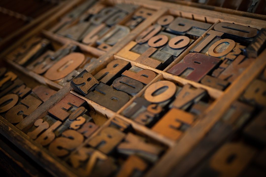
Typography is the one design skill that separates senior designers from everyone else.
Not color. Not layout. Not component libraries. Typography.
I've reviewed work from hundreds of designers over my career. The ones who truly understand type — who know when to use a geometric sans versus a humanist, who understand optical sizing, who can feel when a line height is 2px too tight — they produce work that looks expensive even before they've touched color or imagery.
The good news: you don't need to spend $500 on a type license to do great work. The free font landscape in 2026 is genuinely excellent. There are typefaces available for free that would have cost serious money five years ago.
The bad news: there's also a lot of garbage mixed in. Fonts that look fine in a headline but fall apart in body text. Fonts with incomplete character sets that break when you hit an accented character. Fonts with licensing that seems free but isn't actually free for commercial use.
I'm going to give you 15 fonts I actually use. Not fonts I've seen on lists. Fonts I've typed my own names into and shipped in real products.
Before We Start: The Typography Rules That Actually Matter
Typography is the one design skill that separates senior designers from everyone else.
Never use more than two typefaces. One for headings, one for body. That's it. If you need a third, use a weight variation of one you're already using.
Optical size matters more than you think. A font that's beautiful at 48px can be unreadable at 13px. Always test at actual interface sizes, not just big headers.
Line height is not decoration. Body text needs 1.5–1.7x line height to breathe. Headings can go tighter — 1.1–1.2x. When in doubt, add more line height.
Measure (line length) is ignored too often. 60–75 characters per line is the sweet spot for reading comfort. If your content column is too wide, no amount of beautiful typography will save the readability.
Variable fonts are the future. They load faster than multiple font files, give you more control over weight and width, and they're increasingly available for free. When given a choice, pick the variable version.
Now, the fonts.
Display & Heading Fonts
These are fonts that shine at large sizes — hero headlines, section headers, product names.
1. Cabinet Grotesk
What it is: A variable grotesque from Indian Type Foundry via Fontshare. Available in 9 weights from Thin to ExtraBold.
Why it's special: Cabinet Grotesk has a personality that Inter doesn't. The subtle quirks in the letterforms — slightly unusual 'g', interesting 'a', distinctive uppercase 'R' — make it feel designed rather than default. At large sizes, it's expressive. At body sizes, it's completely readable.
I've used Cabinet Grotesk for three SaaS product rebrands in the last two years. All three clients asked "what font is this?" — which is the right reaction. It's distinctive without being weird.
Best pairings: Cabinet Grotesk headings + DM Sans body, or Cabinet Grotesk headings + Source Code Pro for developer tools.
License: Free for commercial use via Fontshare.
Find Cabinet Grotesk on Mantlr →
2. Clash Display
What it is: Another Indian Type Foundry release via Fontshare. A geometric display typeface in 5 weights.
Why it's special: Clash Display is for when you need to make a statement. The letterforms are tight, geometric, and intentional. It commands attention without resorting to gimmicks. Perfect for startup landing pages that need to feel premium and ambitious.
The uppercase is where it really shines. Set "DESIGN RESOURCES" in Clash Display Semibold at 72px and tell me it doesn't look expensive.
Best pairings: Clash Display for headings + Satoshi for body, or Clash Display + Manrope.
License: Free for commercial use via Fontshare.
Find Clash Display on Mantlr →
3. Syne
What it is: A Google Font designed by Bonjour Monde. Variable font with a range from Regular to Extra Bold.
Why it's special: Syne has an editorial quality that most free fonts don't achieve. The wide letter-spacing and distinctive letterforms give it an almost magazine-like feel. It's the font I reach for when a client wants something that feels creative and considered rather than corporate and safe.
Works especially well for creative agencies, design studios, and any product that wants to position itself as design-forward.
Best pairings: Syne Extra Bold headings + Nunito body for friendly tone, or Syne + Public Sans for more serious contexts.
License: Free via Google Fonts. Completely open source.
4. Bricolage Grotesque
What it is: A variable grotesque on Google Fonts designed by Mathieu Triay. Has both weight and optical size axes.
Why it's special: The optical size axis is what makes Bricolage Grotesque special. As you scale it down, the letterforms adapt — counters open up, spacing increases, strokes adjust — to maintain readability at every size. This is what type designers call "optical sizing," and it's rare in free fonts.
The result is a typeface that works genuinely well at both 72px and 14px — which is the font equivalent of a Swiss army knife.
Best pairings: Bricolage Grotesque for both headings and body (just change the weight), or Bricolage Grotesque + JetBrains Mono for technical products.
License: Free via Google Fonts. Open source.
Interface & Body Fonts
These are fonts designed for readability at small sizes — the workhorses of UI design.
5. Inter
What it is: The most-used web font in the world, designed by Rasmus Andersson. Variable font with weight, slant, and optical size axes.
Why it's still here: I know. Everyone uses Inter. It's everywhere. But there's a reason: it's genuinely excellent at what it does. Designed specifically for screen readability, optimized for small sizes, with a character set that covers most of the world's languages.
The trick with Inter is to use it well rather than just using it. Don't set Inter at the default weight in the default size and call it typography. Use the optical sizing. Use the tabular numbers for data. Use the tight letter-spacing at large sizes. Inter rewards the designer who understands it.
When to NOT use Inter: When your product needs a distinctive personality. Inter communicates "functional and neutral." If you need "warm" or "bold" or "creative," look elsewhere.
Best pairings: Inter for body + Cabinet Grotesk for headings. Or just Inter throughout at different weights and sizes.
License: Free, open source (SIL Open Font License).
6. Satoshi
What it is: A geometric sans-serif from Indian Type Foundry via Fontshare. 7 weights from Light to Black.
Why it's special: Satoshi is what happens when you take Inter's readability goals and add more personality. The geometric construction gives it a tech-forward feel without feeling cold. The letterforms are slightly more expressive than Inter, making it work better for consumer products versus pure enterprise software.
I've used Satoshi for three consumer SaaS products. It reads as "modern tech startup" in the best way — not generic, not trying too hard.
Best pairings: Satoshi body + Clash Display headings for bold, startup energy. Or Satoshi for everything at different weights for a clean, unified look.
License: Free for commercial use via Fontshare.
7. Plus Jakarta Sans
What it is: A humanist sans-serif designed by Tokotype, available on Google Fonts. Variable font with weight axis.
Why it's special: Plus Jakarta Sans sits in an interesting middle ground between geometric precision and humanist warmth. It's not as cold as Inter, not as expressive as Cabinet Grotesk. The result is a font that works for products that need to feel professional but also approachable — SaaS tools, productivity apps, project management software.
If you're designing something that your users will stare at for 8 hours a day, Plus Jakarta Sans is worth serious consideration. It's easy on the eyes in a way that purely geometric fonts aren't.
Best pairings: Plus Jakarta Sans throughout, or Plus Jakarta Sans body + something bold for headings.
License: Free via Google Fonts.
Find Plus Jakarta Sans on Mantlr →
8. DM Sans
What it is: Designed by Colophon Foundry for DeepMind, available on Google Fonts.
Why it's special: DM Sans is designed for low-contrast rendering — small screens, low DPI displays, anything where letterform details get lost. The counters are open, the stroke contrast is minimal, and the spacing is generous. The result is a font that maintains its legibility even under adverse conditions.
This matters more than designers often realize. Your beautifully designed interface will be viewed on a 7-year-old phone with a cracked screen and reduced brightness. DM Sans holds up under those conditions better than most.
Best pairings: DM Sans body + a more expressive heading font like Syne or Clash Display to add personality.
License: Free via Google Fonts.
9. Manrope
What it is: A geometric sans-serif by Mikhail Sharanda, available on Google Fonts as a variable font.
Why it's special: Manrope has a quality that's hard to name but easy to feel: authority. It's not cold authority like some geometric fonts — it's the authority of something well-made and considered. The slightly wider proportions and clean geometry give it a premium feel that punches above its weight class.
I've used Manrope for financial products and healthcare platforms — contexts where the typography needs to say "you can trust this" without being stiff or corporate.
Best pairings: Manrope headings + DM Sans body for maximum readability. Or Manrope throughout.
License: Free via Google Fonts.
10. General Sans
What it is: Another Indian Type Foundry release via Fontshare. 6 weights, geometric sans-serif.
Why it's special: General Sans is exceptionally versatile. It doesn't have the strong personality of Cabinet Grotesk or Clash Display, but it doesn't have the genericness of Inter either. It sits comfortably in the middle — distinctive enough to feel considered, neutral enough to work for almost any context.
If you're a freelancer who needs one reliable body font that works for 80% of your client work without requiring a new selection each time, General Sans is that font.
Best pairings: General Sans body + something with more personality for headings. Or General Sans throughout when neutral professionalism is the goal.
License: Free for commercial use via Fontshare.
Specialty Fonts
These are fonts designed for specific contexts where a general-purpose sans-serif won't serve you.
11. JetBrains Mono
What it is: A monospace font designed specifically for developers, by JetBrains. Free and open source.
Why it's special: If your product includes any code — inline code snippets, code editors, terminal output, technical documentation — you need a proper monospace font. JetBrains Mono is the best free option available. Designed with programming ligatures, careful letter disambiguation (the l/1/I problem is fully solved here), and optimal readability at the sizes developers actually use.
Don't use Courier. Don't use Consolas. Use JetBrains Mono.
Find JetBrains Mono on Mantlr →
12. Fira Code
What it is: A monospace font by Nikita Prokopov with programming ligatures.
Why it's special: Fira Code is famous for its programming ligatures — the way it combines symbols like -> and => and != into single, cleaner glyphs. For developer tools or products that show code, these ligatures make the output feel polished and intentional.
13. Instrument Sans
What it is: A grotesque sans-serif designed by Rodrigo Fuenzalida for Google Fonts.
Why it's special: Instrument Sans has editorial quality that most interface fonts don't. The letterforms have subtle details that read as craftsmanship at large sizes while remaining completely legible at body sizes. It's the right font when you want "considered and editorial" without going all the way to a serif.
Best for: Editorial interfaces, reading experiences, content-heavy products.
Find Instrument Sans on Mantlr →
14. Raleway
What it is: An elegant display typeface from the Google Fonts library.
Why it's special: Raleway is the free font I reach for when a client says "we want something that feels luxury and premium." The thin weights are genuinely elegant. The uppercase with generous tracking looks like it belongs on a perfume box.
Important caveat: Raleway is a display font. Use it for headlines at large sizes. Don't try to use it for body text — it falls apart below 18px.
Best for: Luxury brands, premium products, fashion-adjacent design work.
15. Public Sans
What it is: Designed by USWDS (US Web Design System) specifically for government and civic tech. Completely free.
Why it's special: Public Sans is designed to be the most neutral, trustworthy, readable sans-serif possible. No personality. No quirks. Just maximum legibility and clarity.
That sounds like a criticism. It isn't. Sometimes neutral and trustworthy is exactly what you need — healthcare, government, finance, legal. For those contexts, Public Sans is perfect.
The Typography Combinations I Actually Use
For consumer SaaS:
Clash Display (headings) + Satoshi (body)
For enterprise/B2B:
Plus Jakarta Sans (headings) + DM Sans (body)
For developer tools:
General Sans (headings) + JetBrains Mono (code/data) + Inter (body)
For creative agencies:
Syne (headings) + Manrope (body)
For fintech/healthcare:
Manrope (headings) + Public Sans (body)
The One Thing Most Designers Get Wrong About Free Fonts
They treat font selection as aesthetic decoration rather than functional communication.
Typography is not about picking something that "looks nice." It's about serving the communication goals of your specific product, for your specific users, in your specific context.
The best typography is invisible. Your users shouldn't notice your font choices — they should just find the interface easy to read and the brand trustworthy. When your typography is working, nobody compliments it. They just stay on the page longer.
That's the goal.
Find All These Fonts on Mantlr
Every font mentioned here is available on Mantlr with direct download links, licensing information, and usage notes.